

A typical pie chart shows two dimensions of data, with one category and an aggregate, or count, of that category. The larger the count, the larger the piece of the ‘pie’, which allows you to see the relationship, or percentage, of each category to the whole. With our Gist Pie Set, we’ve added an additional dimension, allowing you to see multiple pie graphs at the same time.
Now we can view pie sets with more granularity by utilizing three dimensions of the data. First, select the category you’d like each pie chart to represent. Second, select the category to be broken down to represent a ‘slice’ within each pie. Now the information is aggregated, or counted, to show its share of the first category. Let’s look at a few examples.
In our Current US Legislators visualization, we can look at the breakdown by party and age. By hovering over each pie slice, you can see the value and the number of items. For our example, what if you want to know which political party has more representatives based on their age? We see the largest pie slice, or the age with the most representatives for democrats is 70,(15 total); while republicans only have a total of 3 representatives of the same age. The single largest age for republicans is 57, with 17 members of that age. By utilizing the legend on the right, the correlated color of each age will highlight on all pie charts as you hover over the value in the legend. This allows for comparison of the same information in each chart at the same time.
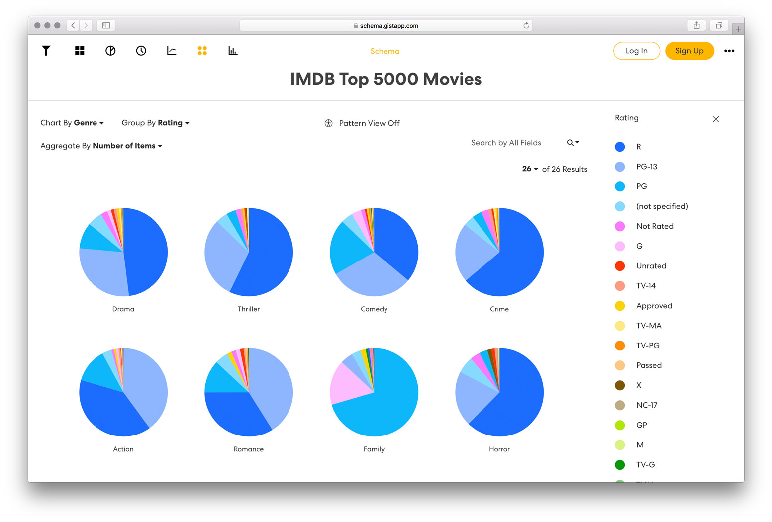
Another interesting visualization to break down this way is the IMDB Top 5000 Movies. By looking here, we can see most dramas, thrillers and crime movies are rated R; while most action, romance and adventures are rated PG-13. By scrolling down the page, more insights are visible into the various genre breakdowns.
With the ability to change each dimension of the view, there are many ways to glean understanding into the varying aspects of the movies we know and love (and many we don’t). To see how movie trends have changed over the years by Ratings, Color, Genre and more, change the “Chart By” to Year, then play with the “Group By” settings .
Does this give you some ideas as to how you may be able to display your data in ways you hadn’t previously conceived? If you haven’t already, create your own visualization with awesome ways to display data on app.gistapp.com.
We look forward to seeing you in Gist!