

The first visualization we’ll cover - the Bar Chart. Gist offers three of the most widely used bar charts: Horizontal (also known as “bar” chart), Vertical (also known as “column” chart) and Stacked (can be used with a vertical or horizontal charts). The purpose of this chart type is to compare, or show the trend of, multiple variables. Let’s take a tour of the bar chart features and I will use a few examples to explain which type will best showcase your data.
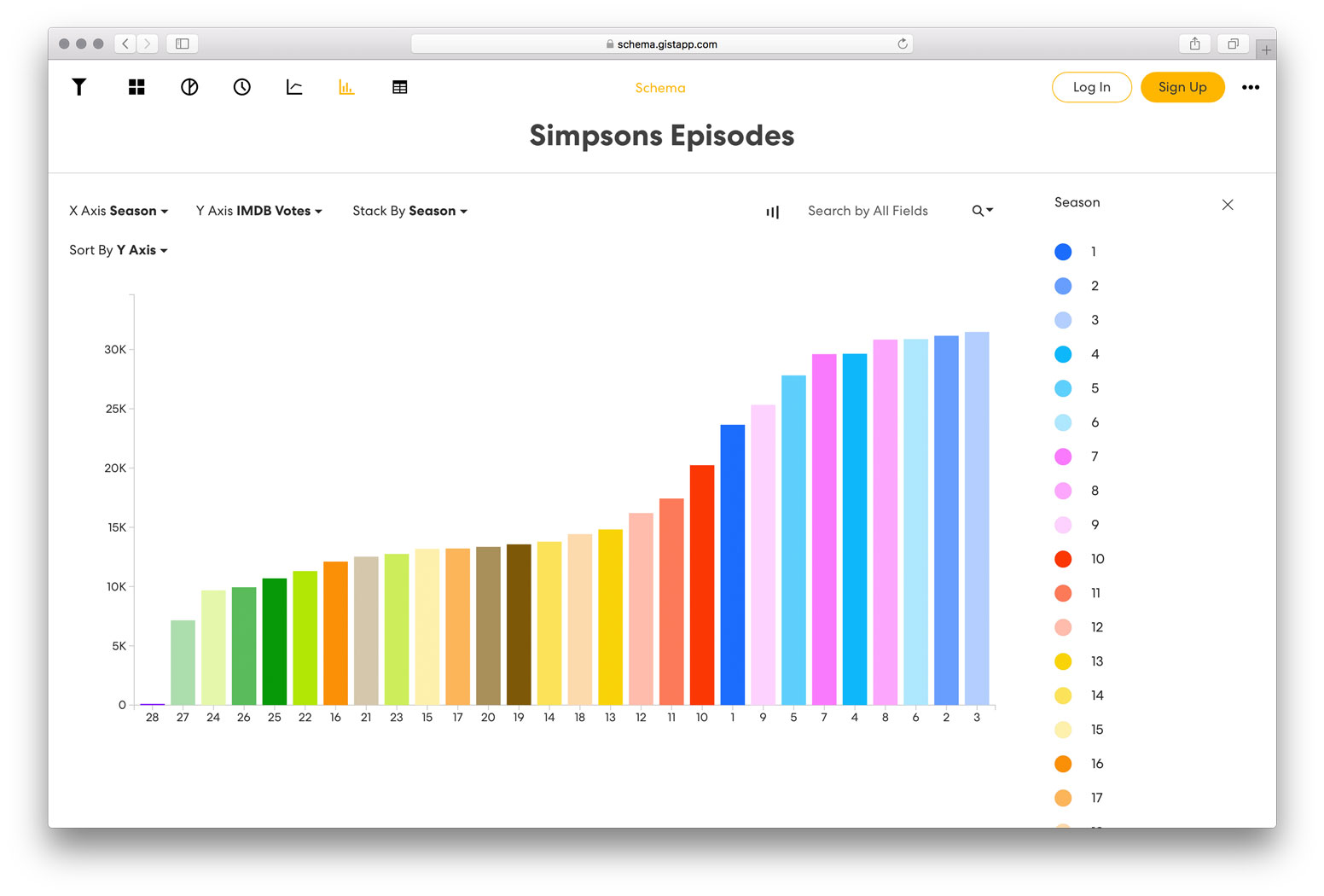
Like all of our visualizations, the bar chart is dynamic and interactive. Let's look at how to populate this visualization type with the X Axis and Y Axis labels. In the Simpsons Episodes visualization, we have aggregated the X Axis by IMDB votes and the Y Axis by Season. By clicking the aggregated category next to either label a drop-down menu will appear – giving you the option to change the variables represented on the chart. In this specific visualization the Y Axis only has one option, but the X Axis has several.
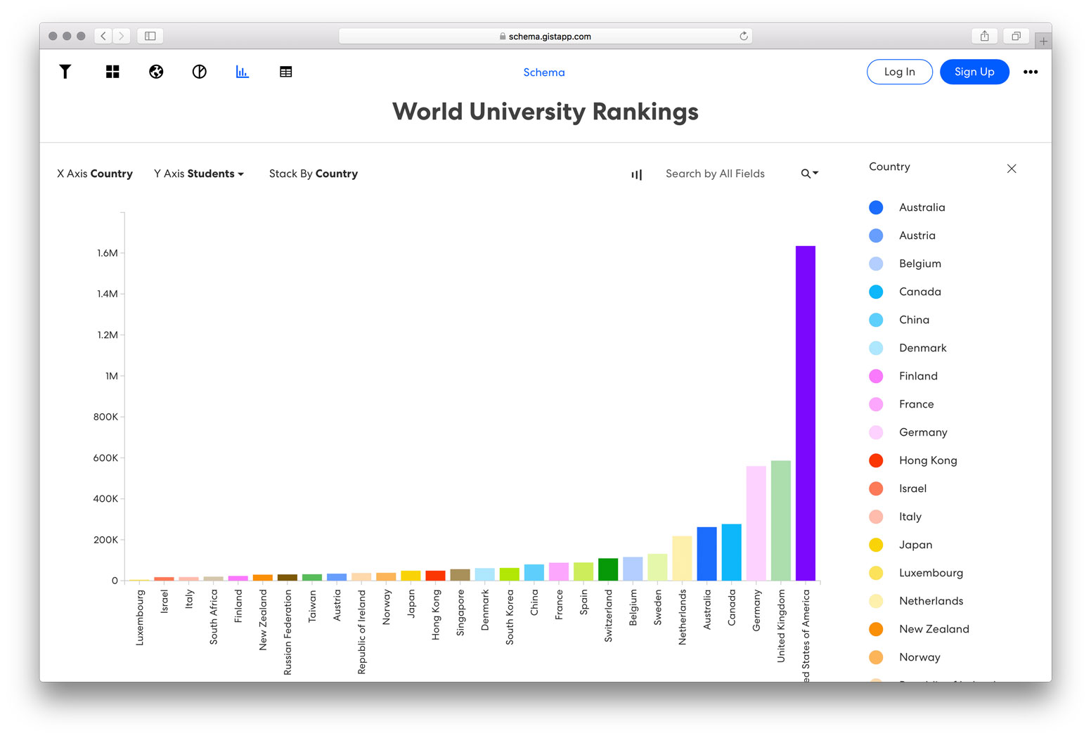
By clicking the horizontal or vertical chart toggle you can easily switch between the two chart types. The difference between these two very similar chart types is minimal, but choosing the right one will help elevate your data. First, let’s take a look at the horizontal, or “bar”, chart. The narrow layout of this visualization is a great way to avoid clutter when you have long labels or a large dataset with many variables. For example, in our World University Rankings visualization, we compared the number of students attending universities to the 28 countries surveyed. With this horizontal format, you can easily distinguish each individual country with the help of the legend.
The vertical, or column, chart is best used if you have a smaller amount of categories, or variables, to compare (12 or less) or if your dataset has negative values (since negative values are best associated with a downward direction). In the AIGA and Google Design Census visualization below, we can easily compare the levels of seniority within an organization to the number of employees managed by each level. To convey our data story better, we can use the "sort" toggle to change how the vertical bars are ascending and descending. In this example, having the hierarchy of leadership roles sorted from Junior to Senior best illustrates our data, thus creating a stronger visualization. I suggest you play with this toggle and the “horizontal or vertical mode” toggle to gain more insight into how these features can be best utilized for your dataset.

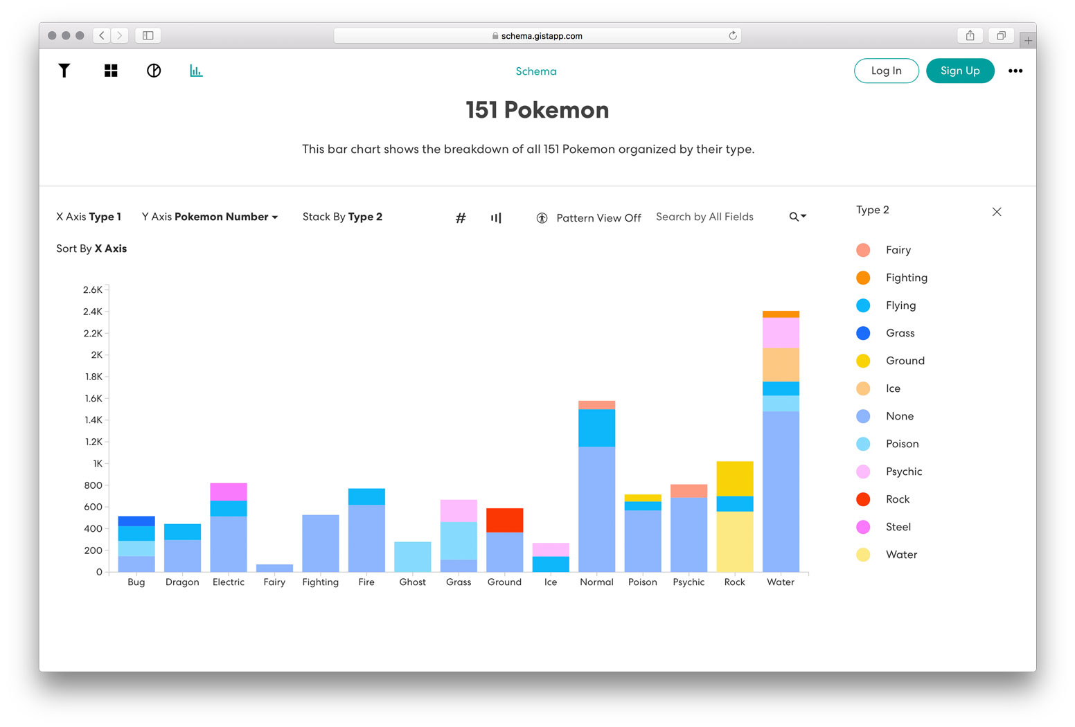
The purpose of a stacked bar, or column chart, is to show the part-to-whole (or share of total) relationship of a specific category. Let’s look at the 151 Pokemon visualization to help explain. Below we see that each rectangular bar represents the category Type 1. Now let’s just focus on the “poison” type. We see that the poisonous Pokemon are split into three sections: 10 Pokemon are strictly poisonous, 2 are poisonous with flying capabilities and an additional 2 are are poisonous with ground capabilities – for a grand total of 14. The three sections are representing a different category and their relationship to the total amount, thus the part-to-whole relationship. To easily distinguish each section, make sure you choose a different color for each category. You can also separate the sections by patterns, rather than color, by clicking "contrast view" toggle to switch it on or off.
If you’re new to creating a bar chart or looking for suggestions, I encourage you to experiment with the visualizations outlined in this article to get started. There are no strict rules to how your data should be presented, but these guidelines will help you choose the right chart type that clearly communicates your data to your audience.
Have you signed up for Gist? Click here to start creating you own visualizations. As always, don’t hesitate to reach out if you need assistance - we’re here to help!