
Visualize your data
Use this guide to help you plan your visualizations in Gist. Select what you want to do below.
Compare categories
Use Gist to display categorical data. This is a dataset of the Rolling Stone Top 500 albums. The dataset has three categories—artist, genre, and subgenre. Data can be summed by any of these categories to make comparisons, for example showing how many rock albums there were, or how many albums the Beatles had in the Top 500.
Download the dataset
Explore the visualization
Download the dataset
Explore the visualization
Compare as percent
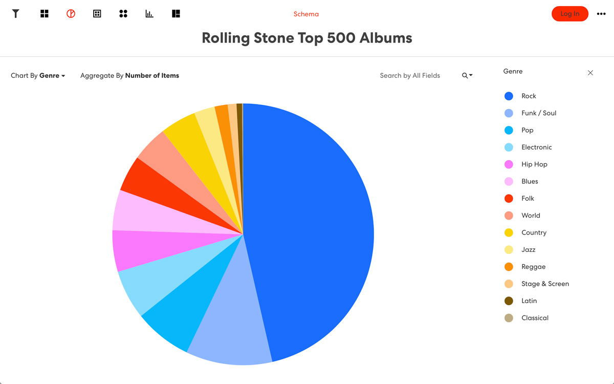
The Pie Chart view divides a circle into segments with the length of each segment representing a proportion of each category to the total sum of all data. Pie charts are useful in visualizing the proportion of categories that make up a dataset as well as for comparing proportions of categories to one another. Here it is used to visualize the percentage breakdown of genres across the Rolling Stone dataset.
Compare across groups
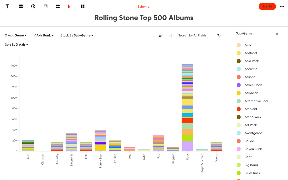
The Bar Chart view is one of the most versatile views in Gist. It can be set to either horizontal or vertical bars. There are several main types of bar charts available, including a basic bar chart, histogram, stacked bar chart, and grouped bar chart. Here we are using the stacked bar chart to make comparisons across the genre and subgenre categories of the Rolling Stone dataset.
Compare as percent, across groups
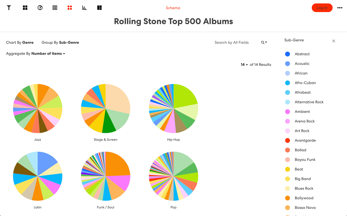
The Pie Set view is a collection of pie charts. This view is useful for visualizing how a share of specific categories changes from one dataset to another. Here we are showing pies for each genre, with the segmentation inside each pie reflecting the subgenre category.
Compare as percent, across groups
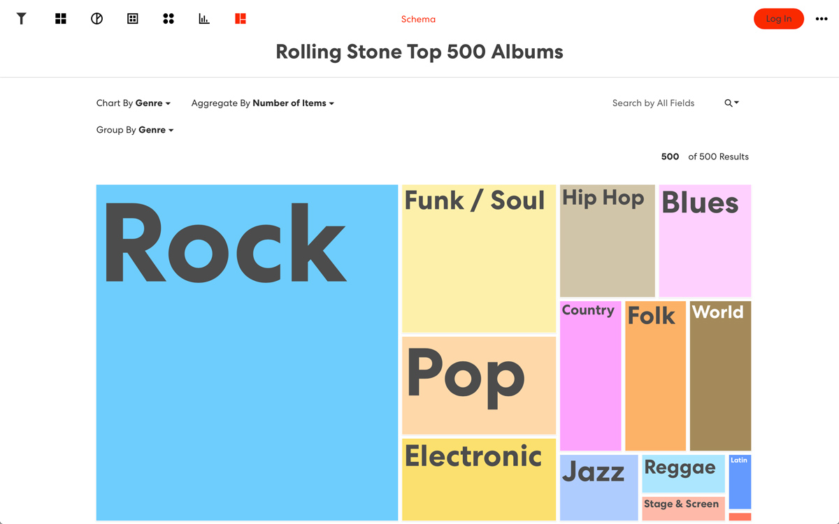
The Treemap view is a collection of nested rectangles. This view is useful for showing hierarchical relations between two category fields of the dataset. It makes it possible to study your data on up to two levels. Here we are using it to map the number of albums in each genre category.
Show trends over time
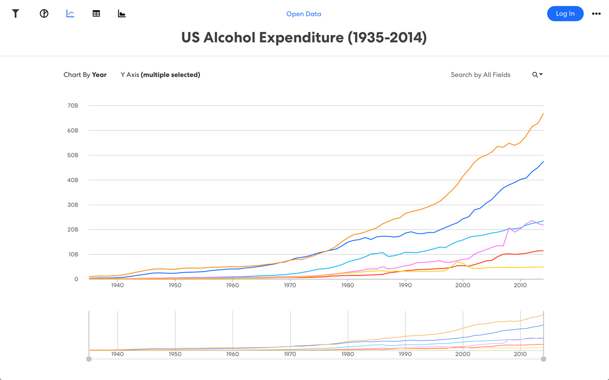
Use Gist to display trends in your data over time. This is a dataset of alcohol expenditure in the U.S. across several venue types, including hotels, liquor stores, and restaurants. The data includes a year column, making it possible to show trends over a certain timespan.
Download the dataset
Explore the visualization
Download the dataset
Explore the visualization
Measurements over time
The Line Graph view displays quantitative values over a continuous interval or time period. Line graphs are useful in visualizing trends and analyzing how the data for one or multiple categories changes over time. Here the graph shows the growth in alcohol consumption across each of the venue types.

Categories over time
The Area Chart view is similar to the Line Graph, with the exception that the area below each line is filled with a color. Simple area charts are used to represent overall trends of quantitative values for one or multiple categories over a time. Area charts are most useful when multiple categories are stacked on top of each other in order to represent the development each category over time as well as in relation to the total sum of all categories. Here the chart highlights the relative size of each venue category over time.
Show change over time
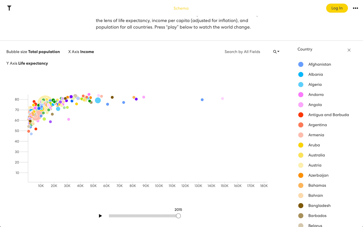
Gist can also show change over time via animation for specific objects in your data. This dataset tracks the income, population and life expectancy of countries in the world since 1800.
Explore the dataset
Explore the dataset
Objects over time
The Bubble Chart view displays a set of bubbles plotted according to two variables, one on the horizontal and the other on the vertical axis of the chart. In addition, the size of the bubble can be set to a variable in your data, and a playback control at the bottom of the screen will play chronologically through a series of Date values. Here, the visualization shows all countries with income on the x-axis and life expectancy on the y-axis, with population mapped to the size of the bubble—animated over time.
Browse collections
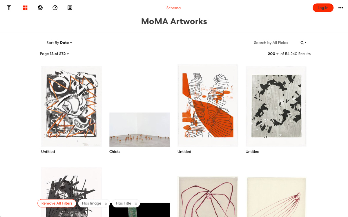
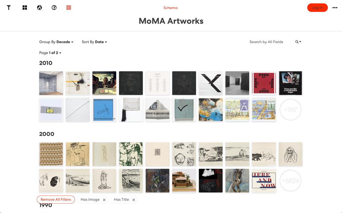
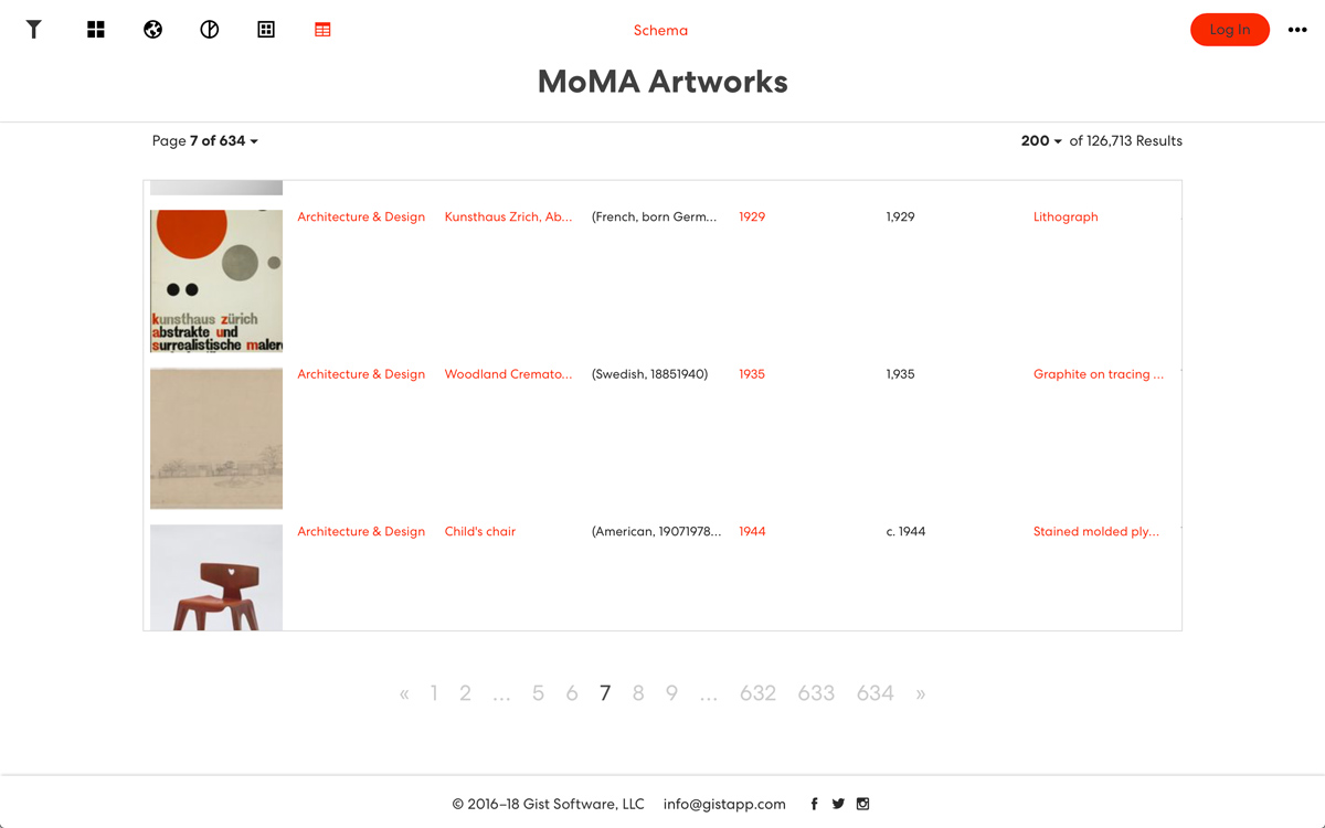
Gist makes it possible to browse objects in your dataset visually. This dataset is of the collection of the Museum of Modern Art in New York. It includes every object in the collection and its metadata, for example the title, artist, date and medium.
Download the dataset
Explore the visualization
Download the dataset
Explore the visualization
Non-hierarchical collections
The Gallery view visualizes every data object in your dataset as a grid. Objects can be filtered by categories or ranges in your data, and sorted in alphabetical or numeric order. Galleries can display images in your data, as well as icons or colors assigned to categories for each object.
Grouped collections
The Grouped Gallery view is similar to the Gallery, but it groups data by category, numeric range or time range (e.g. Decade, Year, Month). Here it is used to group MoMA’s collection by decade.
Collection metadata
The Table view is useful for showing the raw data in a compact way, for seeing the data contained in a visualization, and when a more detailed and precise data comparison is required.
Map country data
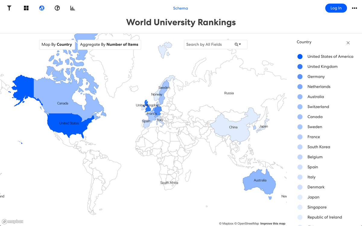
Gist can visualize geographic data on a global country map. This is a dataset of university rankings across the world, with universities categorized by country. Gist can sum data for each country to show the distribution on a map.
Download the dataset
Explore the visualization
Download the dataset
Explore the visualization
Compare areas by country
The country map (included in the Map view) displays countries of the world with the color of the region corresponding to a value in the dataset. Also known as a choropleth map, this map is useful for understanding how data is distributed geographically as well as for relative country comparisons with respect to various factors such as demographics, economics, or other. Here, it is used to show the distribution of top universities by country.
Map regional data
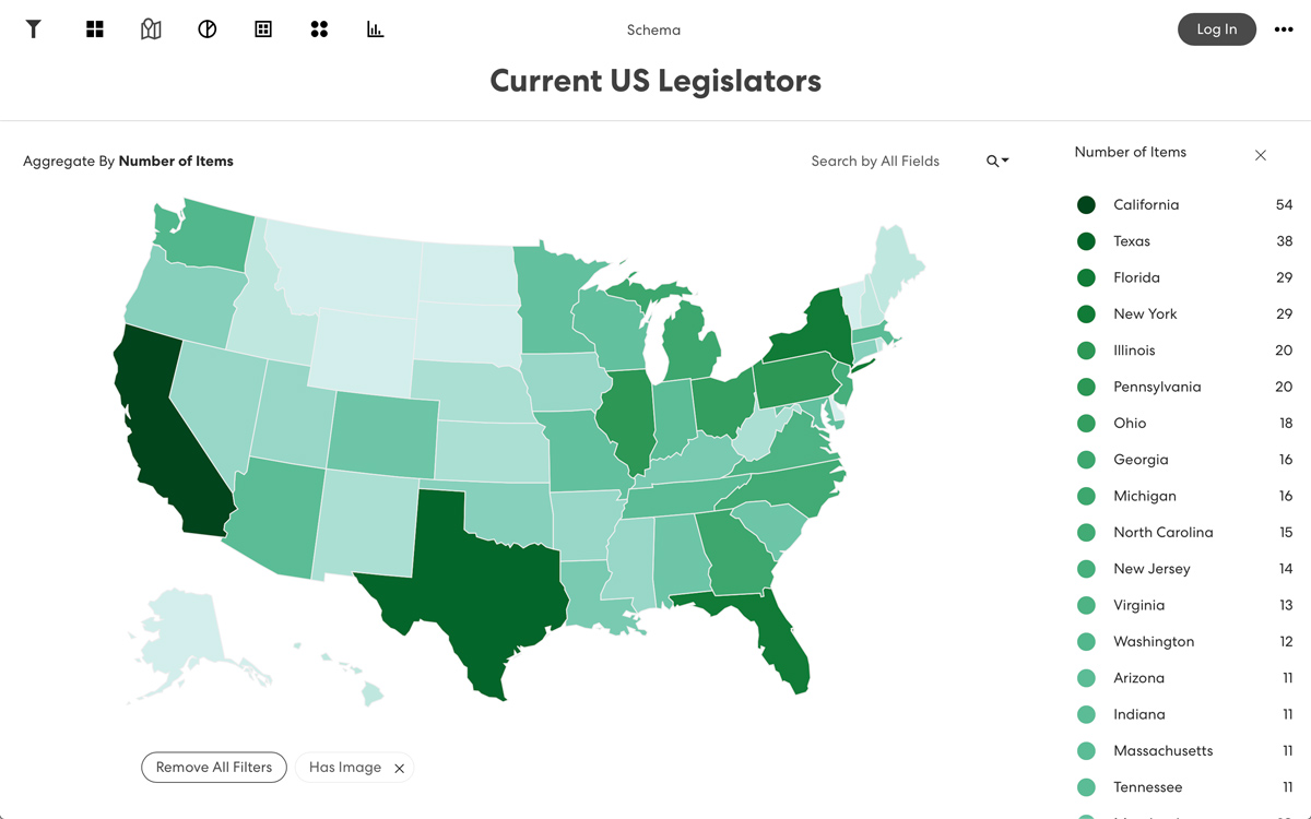
In addition to countries, Gist can also visualize data by region—states, provinces or counties. This is a dataset of US legislators, including their type (senator or representative), party affiliation, and state.
Explore the dataset
Explore the dataset
Compare areas by region
The Regional Map view colors geographic areas according values in the data, at the level of the state, county, province, or prefecture. Regional Maps are available for a variety of regions including US, China, India, Asia, ASEAN, and Europe. The Regional Map provides a way to visualize how the data varies across a specific geographic region and how its subregions parts compare to one another. Here, the Regional Map is used to show a comparison of states with the most legislators.
Map location data
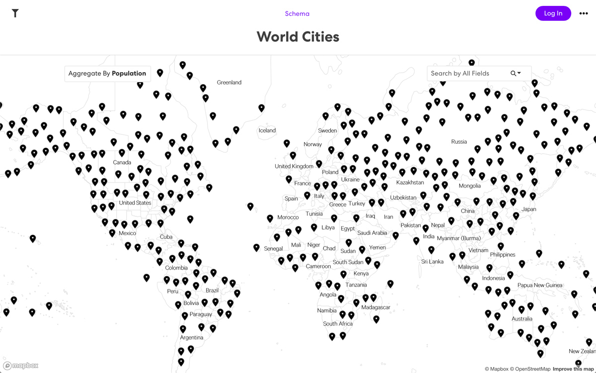
It is also possible to plot location data geographically, as long as your data includes latitude and longitude fields. This is a dataset of cities across the world including the population as well as the latitude and longitude for each city.
Explore the dataset
Explore the dataset
Simple coordinates
The pin map (included in the Map view) displays pins at the specific geographic location on the map based on latitude and longitude coordinates. The pin map is useful for getting a sense for how the data is distributed geographically. Here it shows the locations or cities around the world.
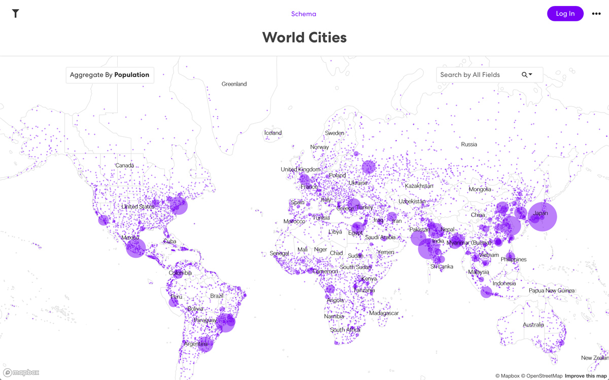
Coordinates with magnitude
The bubble map (included in the Map view) displays circles at the specific geographic location on the map based on latitude and longitude coordinates. The size of the circle can be set to correspond to a value in the data set. The Bubble Map is useful for getting a sense for both how the data is distributed geographically as well as for relative comparison of the values in the dataset. Here it shows the locations of cities around the world with bubbles sized by population.
Map origin and destination
Finally, it is possible to map routes between two sets of latitude/longitude coordinates. This is a dataset of flight paths, including an origin and destination set of latitude/longitude values, as well as the flight number.
Explore the dataset
Explore the dataset
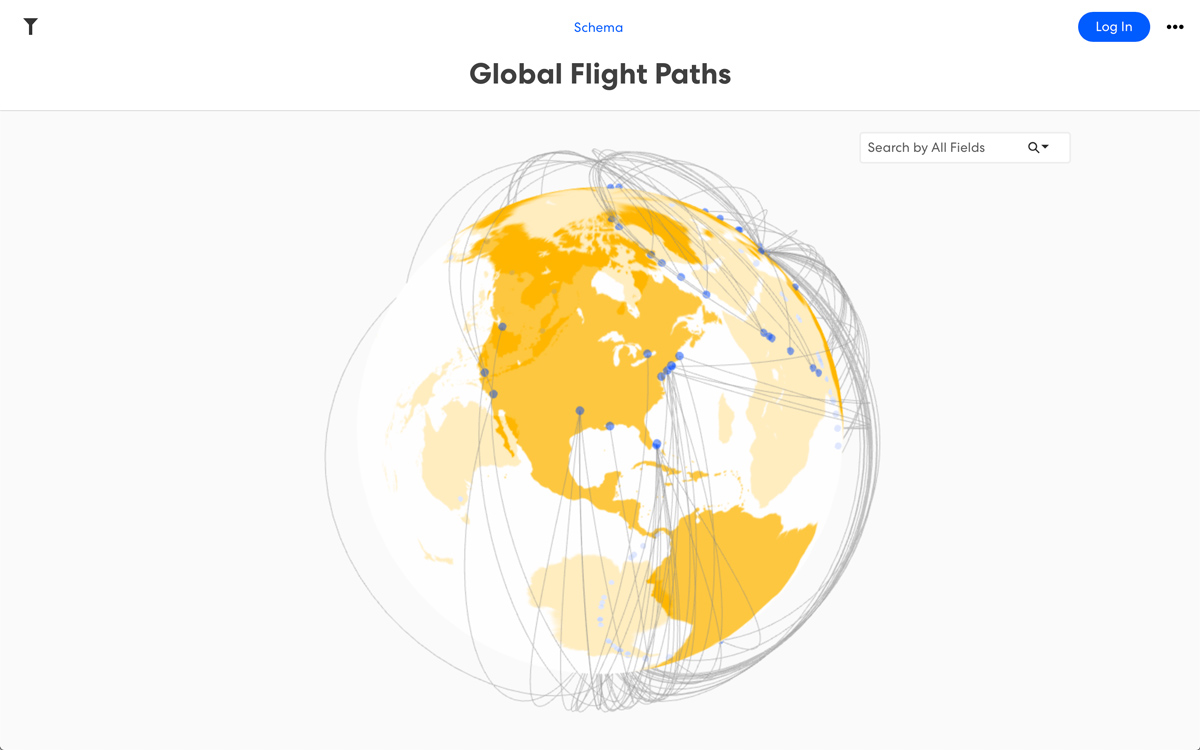
Map routes between locations
The Globe view visualizes locations on the surface of a globe based on latitude and longitude coordinates. In addition, it is possible to specify an origin and a destination for coordinates. This will draw connecting lines between the two points. The View can be used to simply visualize points on a globe, as well as visualizing paths from an origin to a destination. Here it is used to show flight paths around the world.
Show relationships in numeric fields
Gist makes it possible to show relationships based on numeric fields. This is a dataset of TED Talks, taken from the TED website. The talks were rated by users according to a set of attributes, including “funny”, “confusing”, and “inspiring,” and each field includes the sum total of these ratings.
Download the dataset
Explore the visualization
Download the dataset
Explore the visualization
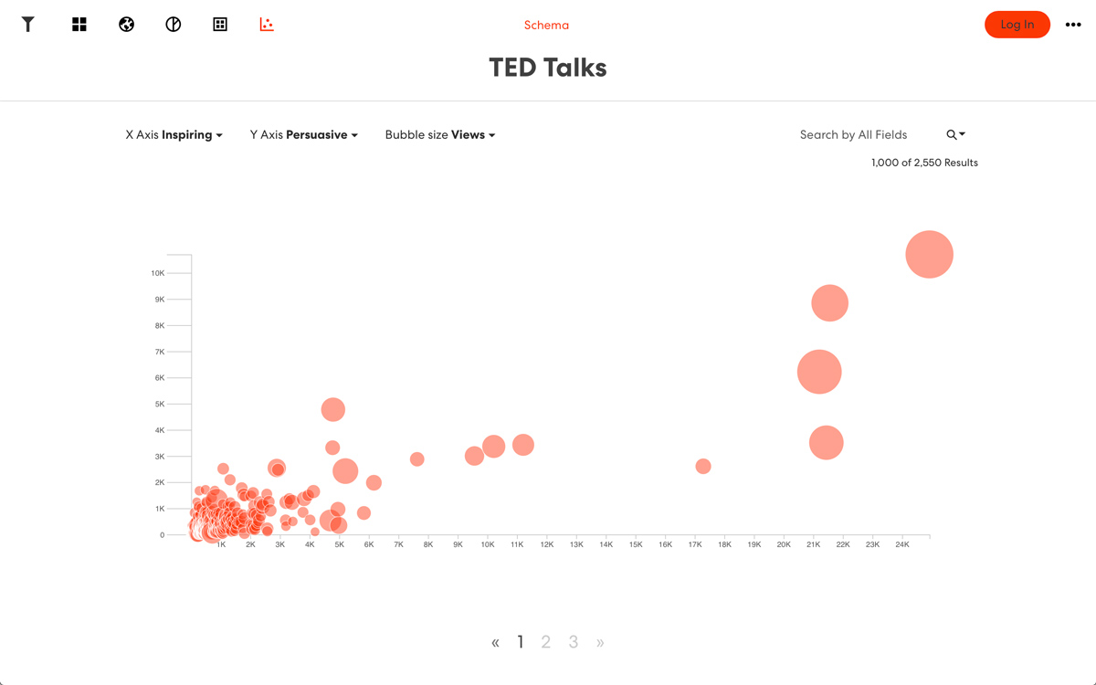
Compare two or more variables
The Scatterplot view displays a set of bubbles plotted according to two variables, one on the horizontal and the other on the vertical axis of the chart. In addition, the size of the bubble can be set to a variable in your data. The Scatterplot can be used to detect relationships that might exist between the variables as well as spotting outliers—values that don’t follow the same pattern as the others. Here, it is used to show the ranking of TED talks according to two attributes, to highlight the distribution of talks relative to the selection.
Visualize word frequency
Use Gist to visualize how many times specific words appeared across a field or set of fields. This is a dataset of talks at the South-by-Southwest (SXSW) conference. Text fields like the “summary” field can be parsed to extract popular words and highlight them.
Explore the dataset
Explore the dataset

Display word popularity
The Word Cloud view displays a set of words extracted from Text Fields in your dataset, organized by frequency. The Word Cloud can be used to show the words are used most often within your data. Here is it used to highlight the most popular words in the SXSW talk summaries.
Try this interactive visualization of the various views Gist has to offer.